Adobe Illustrator
Graphic Designer
BCIT Adobe Illustrator
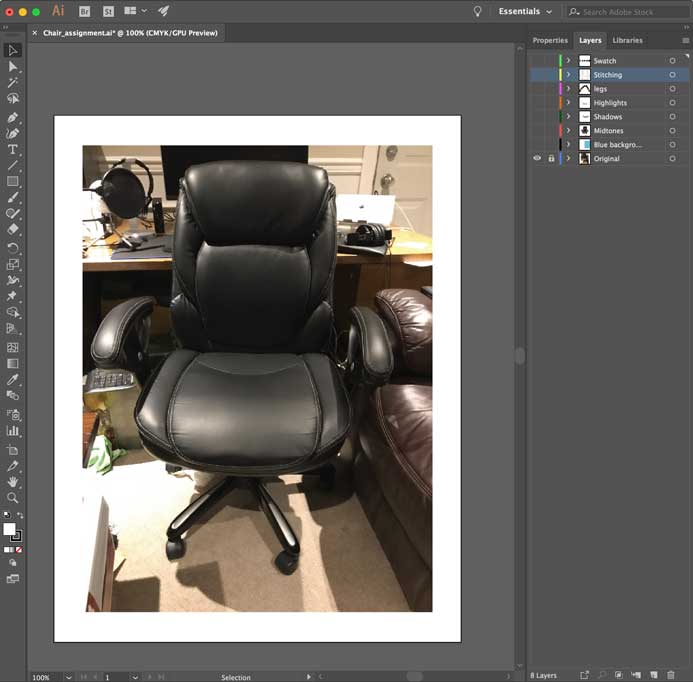
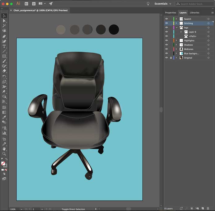
I chose this particular picture for the assignment because of how the light was shining on the chair, showing the shadings and points of highlights. I looked over the image, identifying where the shadows, mid-tones, and highlights would be, creating a layer for each. When I start a particular project I always like to make sure all layers are labeled so my workspace is organized, and I won’t waste time trying to find a certain layer/object. As you can see from the image, I organized the layers name by swatch, stitching, legs, highlights, shadows, mid-tones, blue background and of course the original image with the layer locked so while tracing the image won’t move.
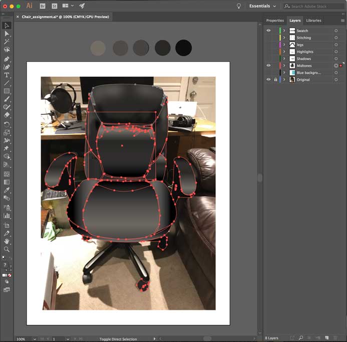
For the first step, I started tracing the leather chair with the pen tool, on the mid-tones layer. After I finished tracing the chair, I went through each section with gradient layers (mostly linear gradients based on the direction of lighting in the original image). I played around with the opacity and added Gaussian blur to them as I was doing this as well, to make the gradient blend well with the rest of the chair and make it look as realistic as possible. This technique helped greatly shape the overall image towards the right direction.

The next step that I took was the shadows for the image. The use of the linear gradient tool took care of most of the shadows as well but there was still room for improvement. As you can tell from the image, I added a shadow on the seat of the chair. How I achieved the shadow was using the tone from the eye dropper (that I had added to the swatch layer) and then I used the Gaussian blur effect and later played with the opacity and adjusted the anchor points accordingly.
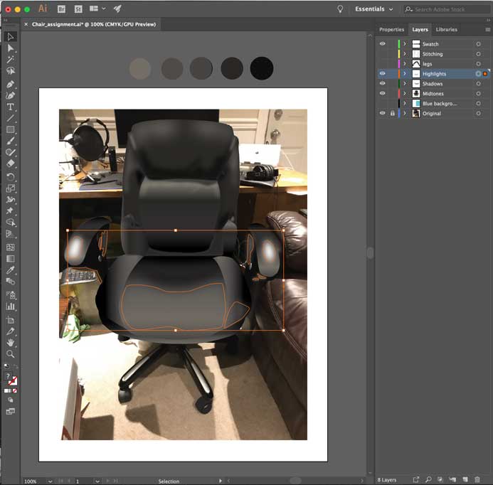
The step after the shadows was the highlights for the image. The use of the linear gradient really brought out the highlights of the chair but there were some points where there could be more highlights. In the image you can see the key points that I traced with the pen tool and I also used the lightest color from the swatch, while adding Gaussian blur to soften the color effect to come up with more defined highlights that really make the chair standout.

The final touch was adding the stitching which I felt really made the chair look as closely realistic as the original image. How I achieved this look was just tracing the stitching with the pen tool (just making linear lines) and then going to properties and changing the appearance of the stroke to stroked lines at 1pt.
Overall, I feel the overall result is as close to realistic as possible. For this assignment, I felt as if I learnt a lot of great techniques to capture the essence of an image and be able to obtain the results I have. Having been used to traditional drawing techniques it was really intriguing to finish this illustration, while looking forward to many endless possibilities.